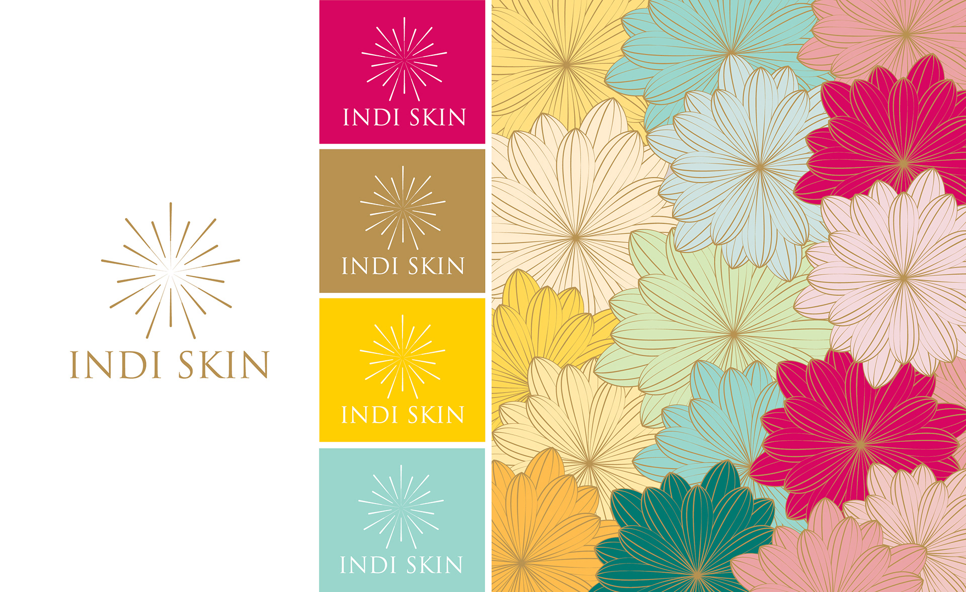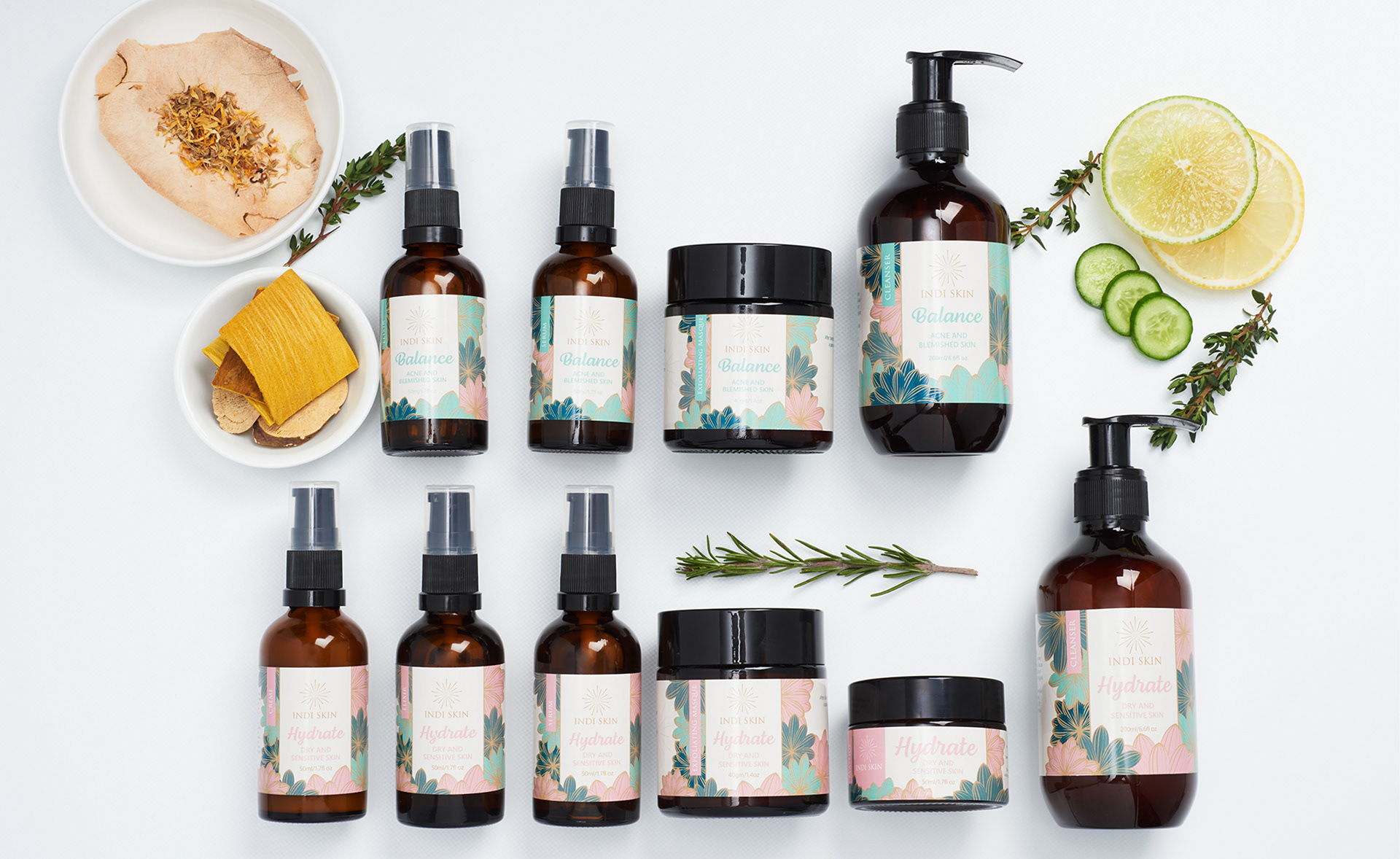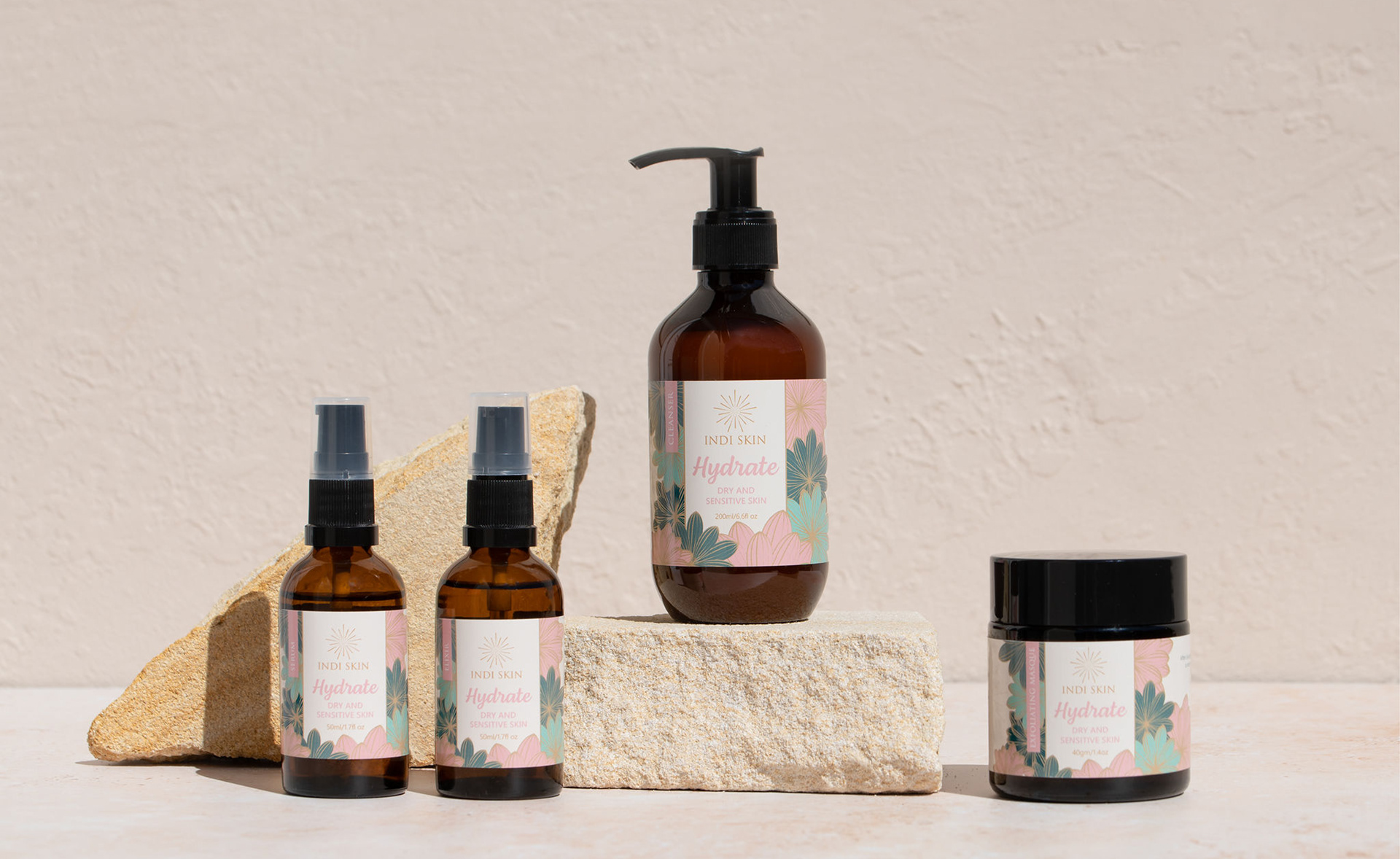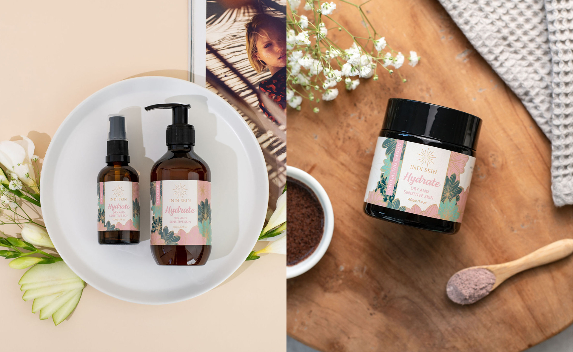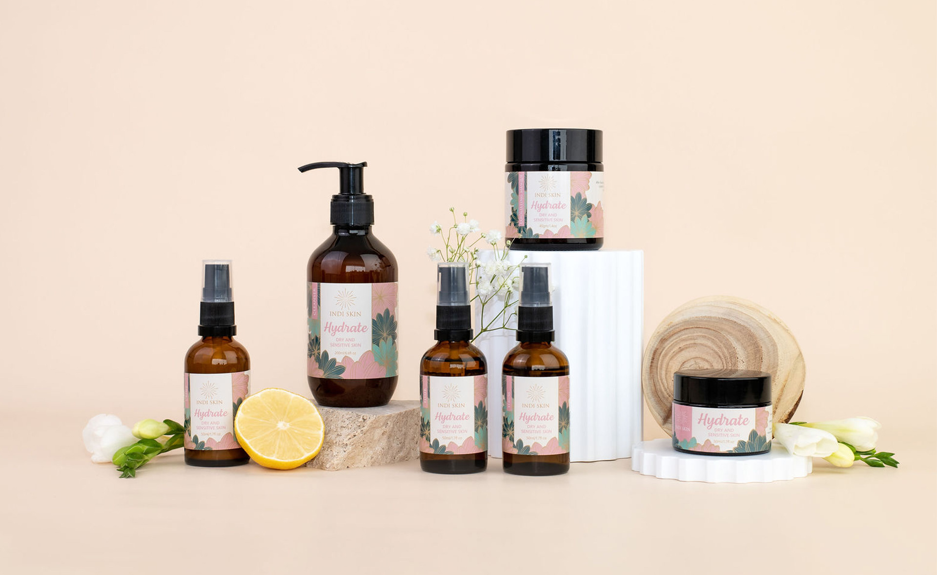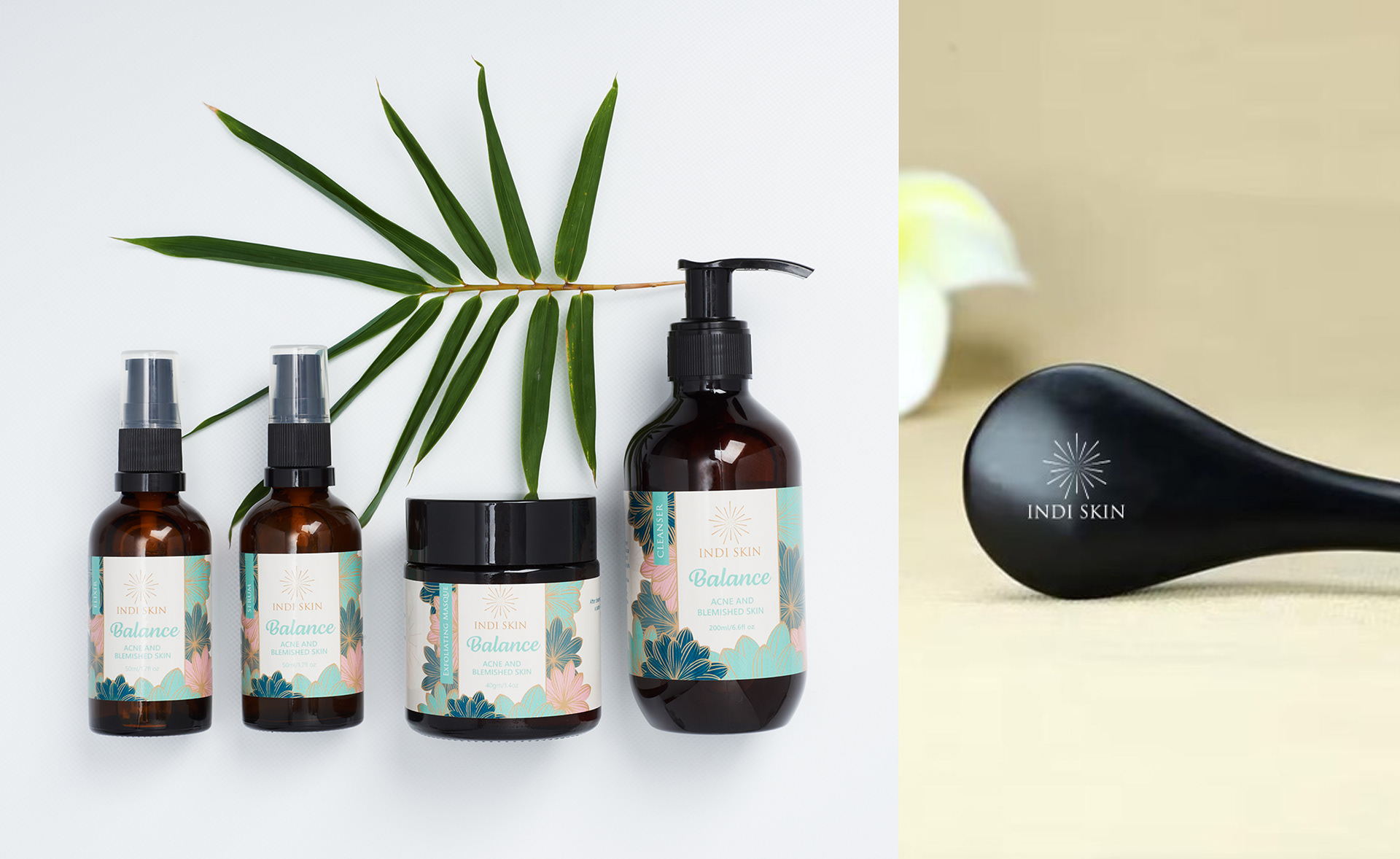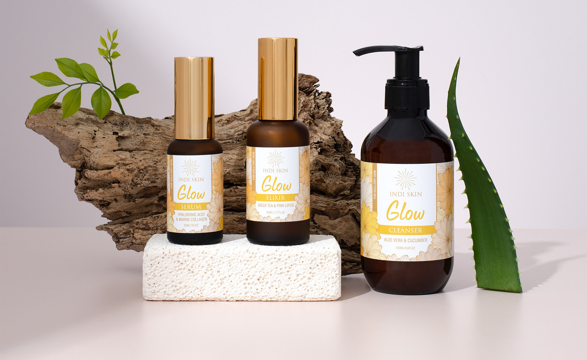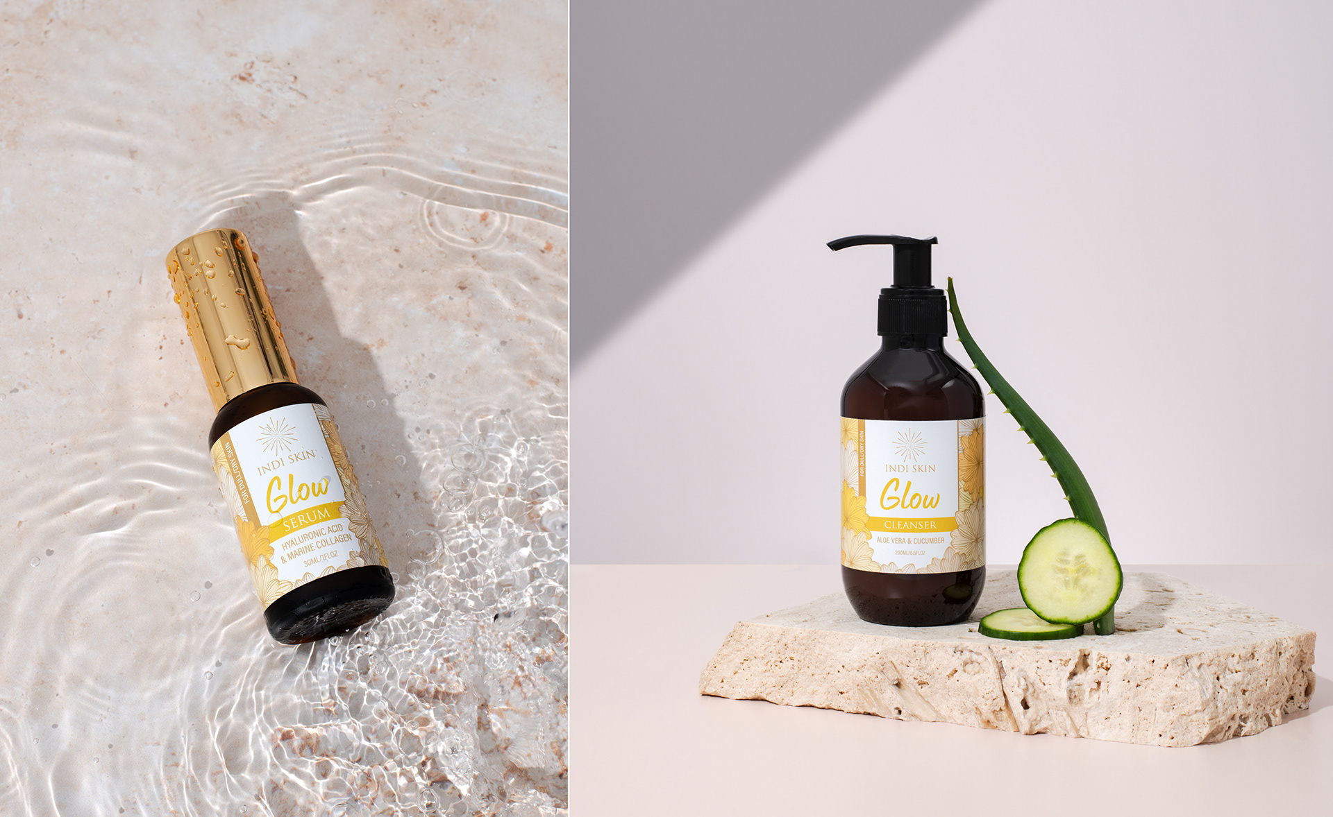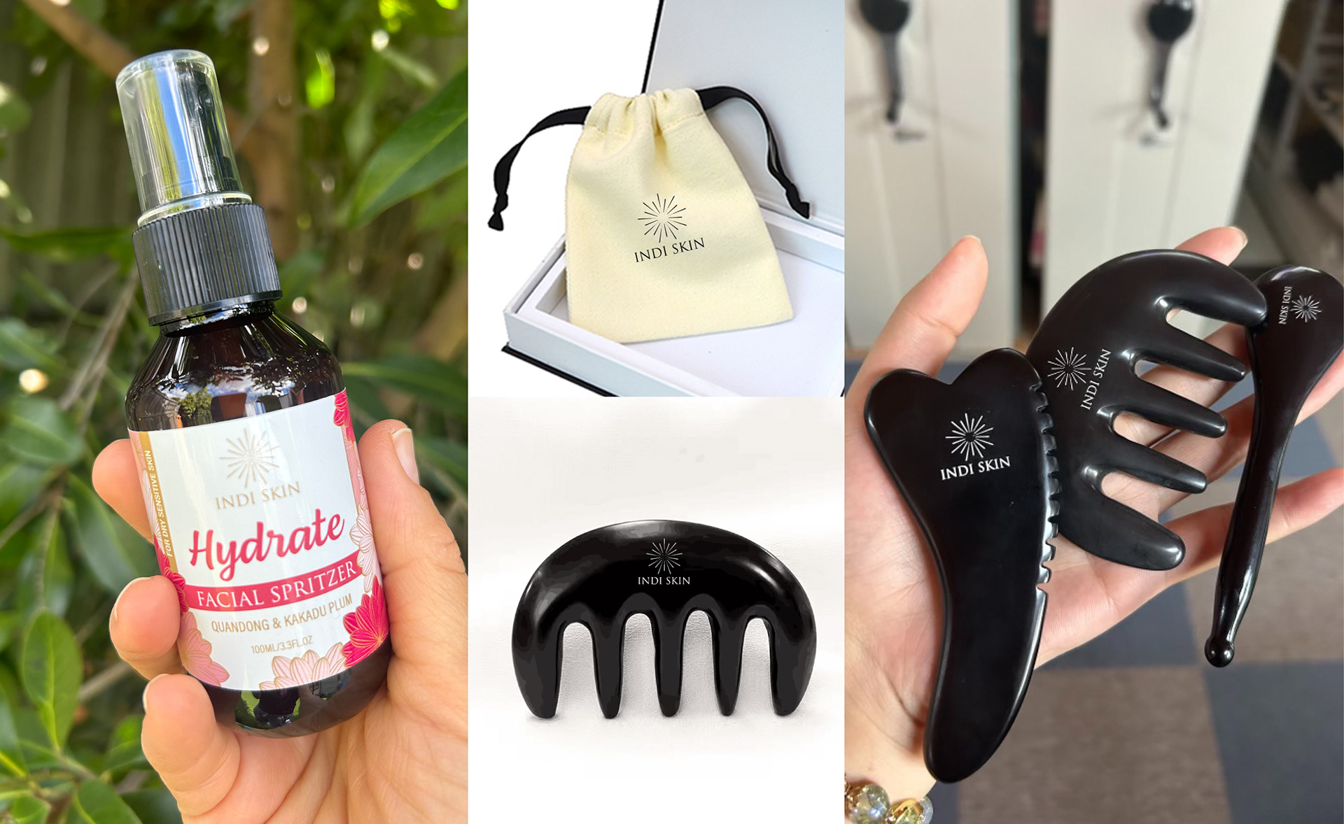
I was tasked with creating a brand identity for Indi Skin that reflected the principles of acupuncture and the fusion of Eastern and Western philosophies, while also capturing the fun, vibrant personality of the owner. Indi Skin offers cosmetic acupuncture and a 100% natural skincare range, necessitating branding that represented their holistic approach to skincare alongside their unique sensibilities.
The logo features an energetic and joyful design, using an acupuncture needle to create a starburst or sun pattern. The packaging design aimed for a soft, feminine aesthetic, incorporating Chinese-inspired florals. The colour palette was inspired by the owner’s favourite hues of pink, blue, yellow, and gold, further enhancing the brand's vibrant character.